2 Minutes
Google's latest update to Android 16 Beta 2 introduces a subtle yet impactful change to the lock screen's notification display. This enhancement focuses on making read notifications more transparent, offering a cleaner and more cohesive user experience.
In the initial release of Android 16's QPR1 Beta, Google introduced a feature titled "Show Seen Notifications." This feature reimagined the presentation of previously viewed notifications by condensing them into a compact capsule beneath new alerts, aiming to create a more minimalist and less intrusive interface.
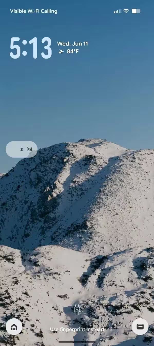
Building upon this foundation, the second beta version has refined this design by transitioning the capsule from an opaque to a transparent appearance. This adjustment ensures that silent and read notifications blend seamlessly with the device's background, reducing visual clutter and enhancing the overall aesthetic appeal of the lock screen. Additionally, the feature's name in the settings menu has been updated to "Viewed Notifications" to better reflect its functionality.
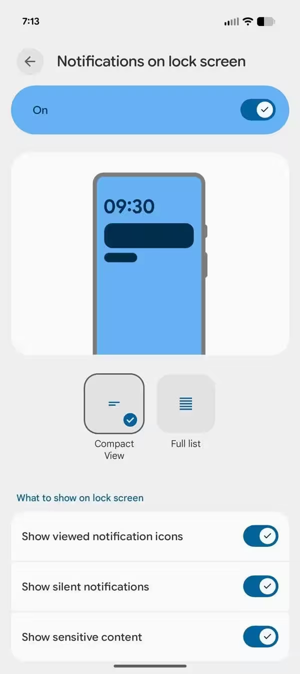
To activate this feature in the latest Android 16 beta, navigate to Settings > Notifications > Notifications on lock screen. It's worth noting that other sections of the notification menu remain unchanged in this update.
The move towards transparent notifications aligns with Google's Material 3 design philosophy, which emphasizes visual elements that are context-aware and harmonize with their surroundings. This design evolution mirrors trends in other operating systems, such as the recently introduced glass-like aesthetics in iOS 26.
Conclusion
Android 16's introduction of transparent notifications signifies a thoughtful step towards a more refined and user-friendly interface. By subtly integrating read notifications into the lock screen's background, Google enhances both the visual appeal and functionality of the user experience, reflecting a broader commitment to design excellence and user-centric innovation.
Source: 9to5google

Comments