3 Minutes
Google Gemini Gets a Bold, Colorful Makeover
A touch of color can transform any digital product, and Google knows this better than most. Over the years, the tech giant has made the rainbow spectrum a cornerstone of its brand identity, and now in 2025, it’s taking that philosophy even further with Gemini—the company’s advanced AI platform.
The Evolution of Gemini’s Visual Identity
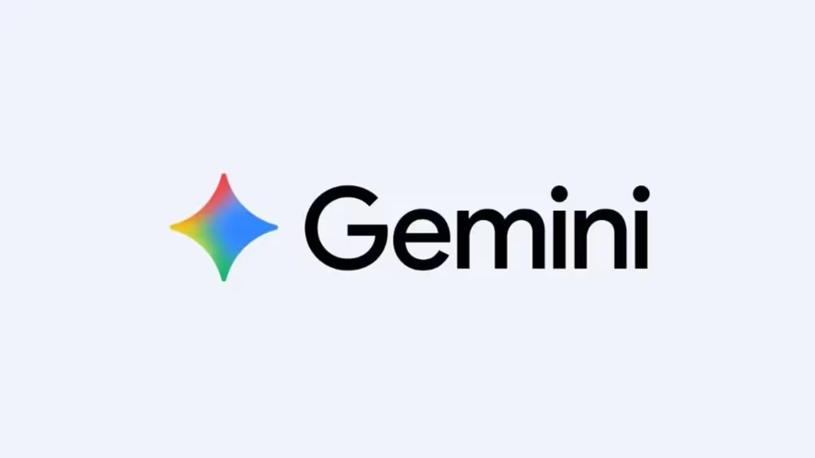
Previously, Google’s Gemini featured a darker palette made up of reds, blues, and purples. While distinctive, this color scheme didn’t fully capture the vibrancy found elsewhere in Google’s ecosystem. That all changed during a recent update, when eagle-eyed experts noticed Gemini’s iconic four-pointed star logo transitioning to a full rainbow gradient, echoing Google’s renowned, multicolored 'G' logo.
Official Launch: Gemini’s Rainbow Star Arrives
This week, the transformation became official as the Google Gemini X channel unveiled the new rainbow-themed star logo. This shift is more than just an aesthetic change. By embracing a broader, more dynamic color palette, Google aims to better align Gemini’s visual identity with the company’s other flagship products, making it instantly recognizable and visually appealing across digital interfaces.
Product Features and User Experience
Gemini is Google’s answer to the growing demand for cutting-edge artificial intelligence in communication, productivity, and data analysis. Its interface is designed for seamless interactions, and the new colorful design not only enhances user engagement but also brings consistency to Google’s product family. Early testers report that the brighter look makes the app feel more welcoming and modern.
Comparisons and Market Position
Compared to other leading AI platforms and digital assistants, Gemini’s revamped visual branding stands out in an increasingly crowded space. By moving away from muted shades and adopting Google’s signature rainbow hues, the rebrand reinforces the platform’s innovation and user focus. For tech enthusiasts and businesses, such polish often translates into greater trust and affinity for the product.
Rollout and Future Prospects in Google’s Ecosystem
While the new Gemini logo is now visible on the X channel and some in-app locations, legacy icons in the Google Play Store and web favicon are still transitioning from their old color scheme. The shift is already visible in Google Search results, signaling a broader rollout is on the horizon.
What’s Next for Google’s Design Language?
With much of its ecosystem already displaying rainbow-inspired elements, Google appears committed to extending this bright, modern style even further. As the company continues to refresh its product interfaces, users can expect a more unified and engaging visual experience across all Google services.
As the Gemini transformation continues, tech watchers are left wondering: which Google service will get the colorful treatment next? Share your ideas in the comments below and join the discussion on the evolving look of digital technology.
Source: androidauthority

Comments