
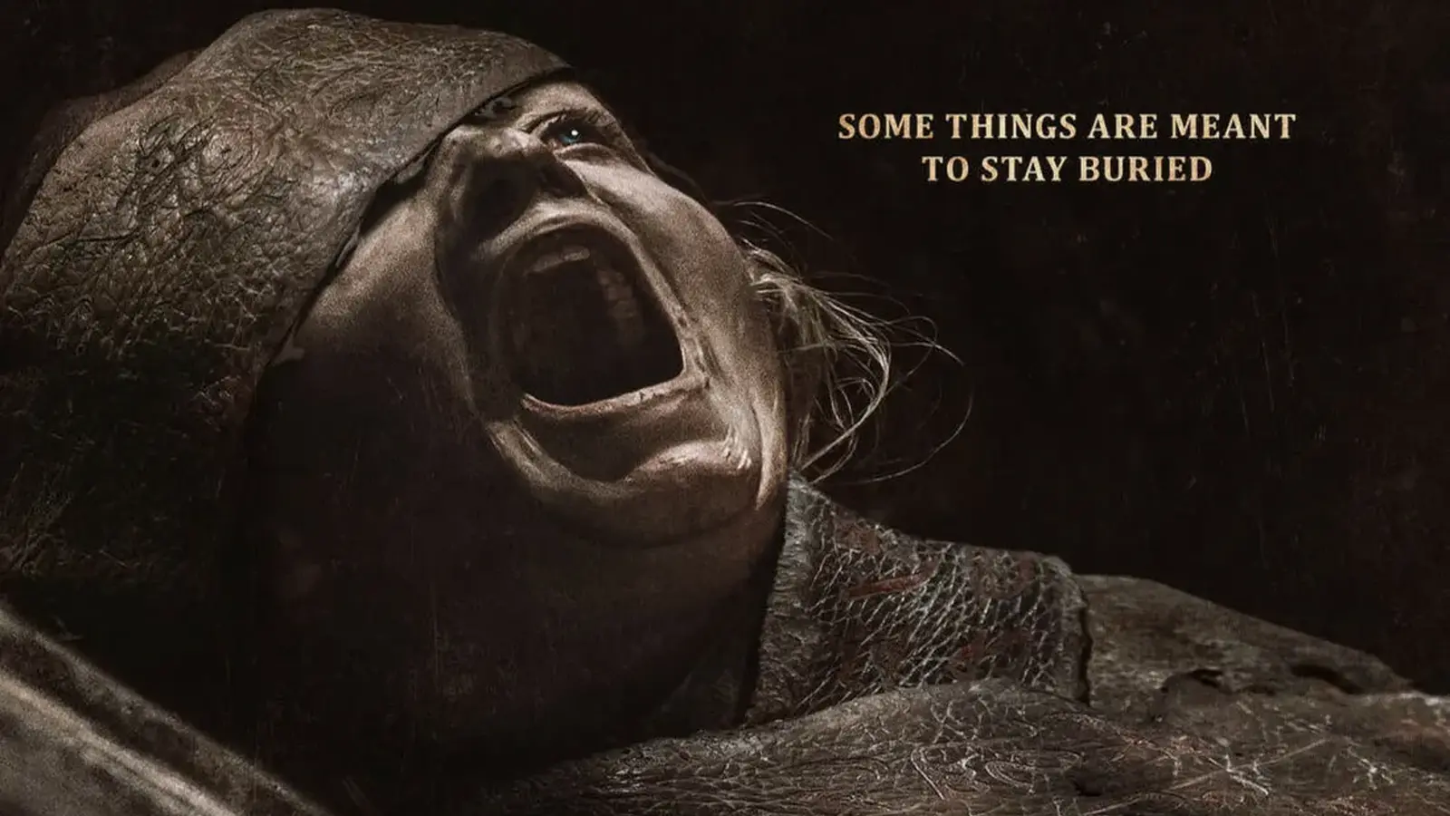
A single image brought a major advertising push to an abrupt halt. The poster for Lee Cronin's The Mummy—displayed on the London Underground and outdoors—prompted dozens of complaints after viewers said the portrait looked disturbingly like a deceased child.
Warner Bros. pushed back. Their team argued the artwork was created responsibly, that the figure is a living mummy who was kidnapped as a child and later returned to her family as a teen or young adult, and that the design intentionally avoided overt violence or threats. They also noted that the campaign had been cleared in advance by Global, the advertising partner for Transport for London, and had permission to go up in stations.
But the Advertising Standards Authority took a different view. After receiving 30 formal complaints, the ASA concluded that the poster's grey, lifeless skin tone, a swollen closed eye opposite a blank, fixed stare, dry cracked lips and a hollowed face combined to create a realistic impression of a dead child. The agency said this realism made the image inappropriate for locations where children are likely to see it.

ASA ruled the posters could be mistaken for a real, deceased child and banned them from public spaces frequented by children.
Think about the power of a look. A single frozen expression can read as menace, tragedy, or history. In advertising, especially for horror, designers walk a fine line between creating unease and causing genuine distress. Regulators are less forgiving when that line appears to cross into territory that could upset minors.
Warner Bros. maintained that their intent was not to shock for the sake of shock. They say the aim was to convey a haunting backstory without explicit gore—using neutrality in expression and removing obvious signs of violence to minimize distress. Yet intent and reception don't always match. Context matters. A subway platform at rush hour is not a cinema foyer where viewers choose to engage; it's a public artery where glimpses happen in passing, sometimes by children alone.
The dispute raises familiar questions about genre advertising. How far can promotional imagery push before it becomes irresponsible? Should platforms that serve families enforce stricter creative limits? And what precedent does this set for studios rolling out fear-based campaigns in urban centers?
For now, the ASA's decision stands: posters that could be read as depictions of a deceased child should not appear where youngsters might see them. Studios will take note. Marketing teams will too. The art of selling horror may have to learn new subtleties about what chills—and what crosses the line.


Leave a Comment
Comments
No comments yet. Be the first.