3 Minutes
Apple has quietly given users more control over its controversial Liquid Glass visual overhaul. With iOS 26.1 developer beta 4, the company added a toggle that lets people dial back the transparency and floating UI elements that sparked criticism across iPhone, iPad, and Mac devices.
Why users complained — and what Apple changed
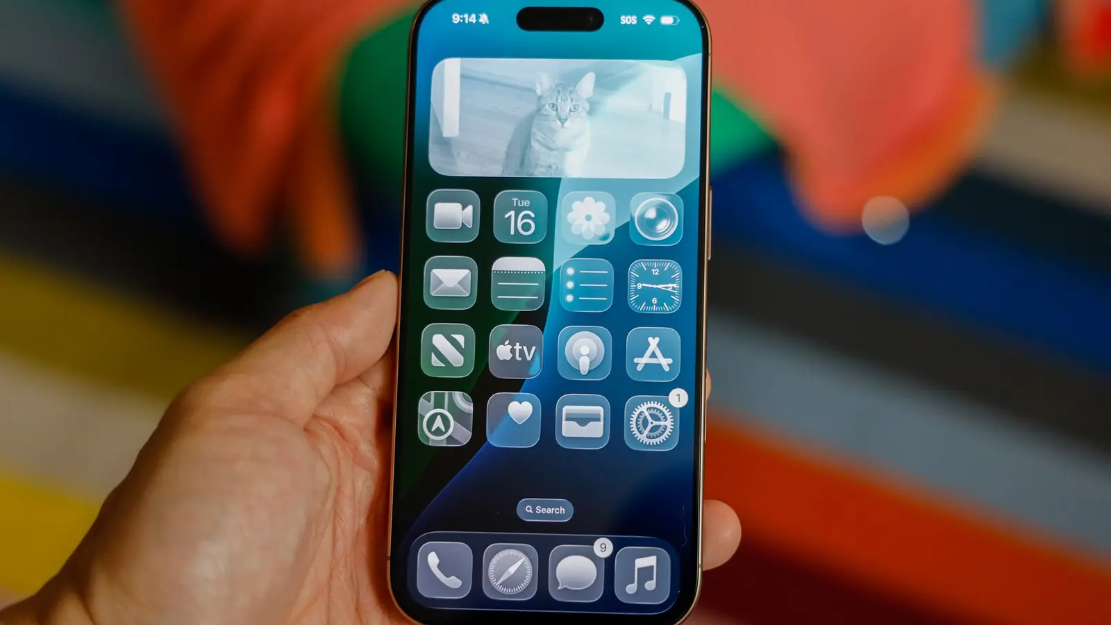
The Liquid Glass look aimed to refresh Apple platforms with heavier translucency, soft layers, and background bleeding. For some, the effect felt modern and elegant; for others it made text harder to read, buttons harder to tap, and notifications more visually cluttered. Bright outdoor lighting only amplified those issues.
Apple listened. Rather than revert the design, the company introduced a simple but practical option to tone it down. That gives users a choice: keep the bold aesthetic or switch to something more practical for everyday use.
How the new Liquid Glass toggle works
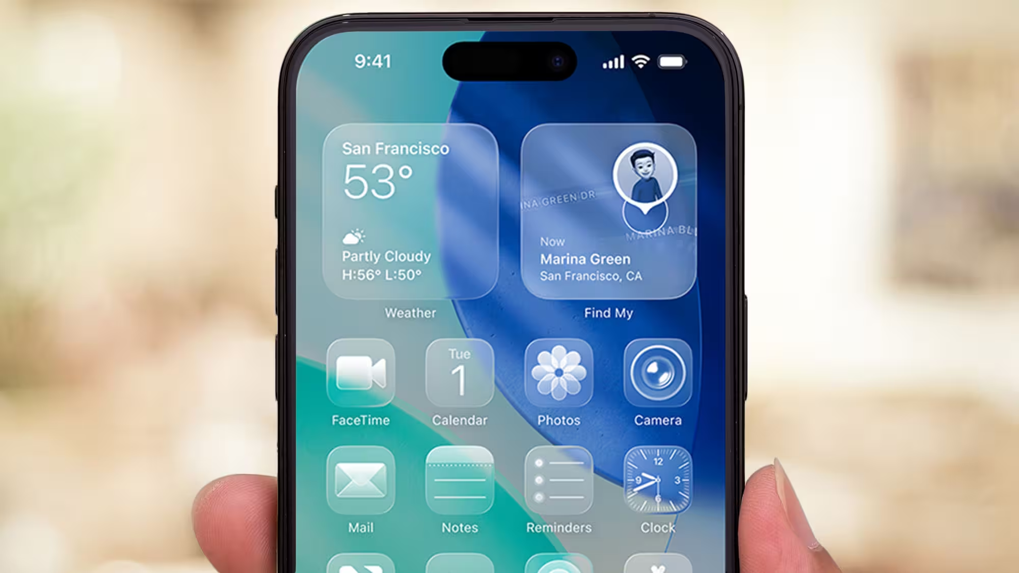
In iOS 26.1 beta 4, the setting appears inside the Settings app. You can pick between Clear, which preserves the high-transparency look, and Tinted, which increases opacity and contrast to improve legibility. On Mac, the same preference is available under Appearance.
- Where to find it: Settings > Display & Brightness on iPhone and iPad; Appearance on Mac.
- Options explained: Clear keeps the glassy, translucent UI; Tinted adds opacity and higher contrast for easier reading.
What this means for everyday use
It’s a small change with a noticeable impact. If you love the aesthetic and have carefully chosen wallpapers and lighting, Clear will deliver the new, airy look. If you frequently use your device outside, or prefer crisper UI elements, Tinted reduces visual clutter and improves touch accuracy.
Keep in mind that the choice is system-wide. Third-party apps that rely on system visuals will inherit the selected preference, so switching modes can change the appearance of many apps at once. Try both options for a day or two to find what fits your workflow.
Why this matters beyond aesthetics
Design choices affect usability and accessibility. By adding a toggle, Apple acknowledges that bold designs need practical controls. The move balances innovation with user comfort — a reminder that design experiments are more successful when users can opt into them.
Quick tip
If you’re running the beta and notice readability problems, try Tinted first. It’s the fastest way to restore contrast without losing the overall refreshed look.
Source: wccftech
Leave a Comment