7 Minutes
A visually strong arrival — but is the color right?
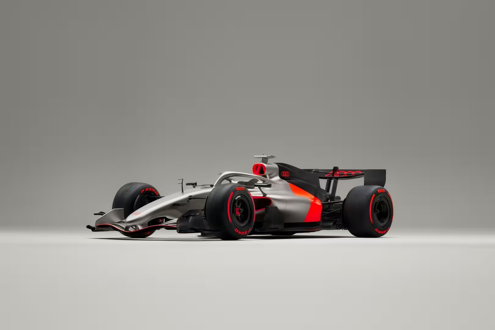
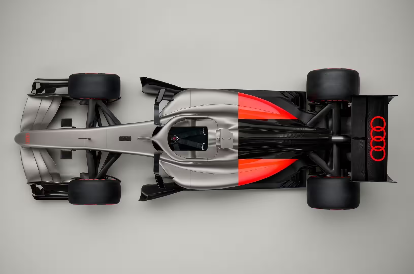
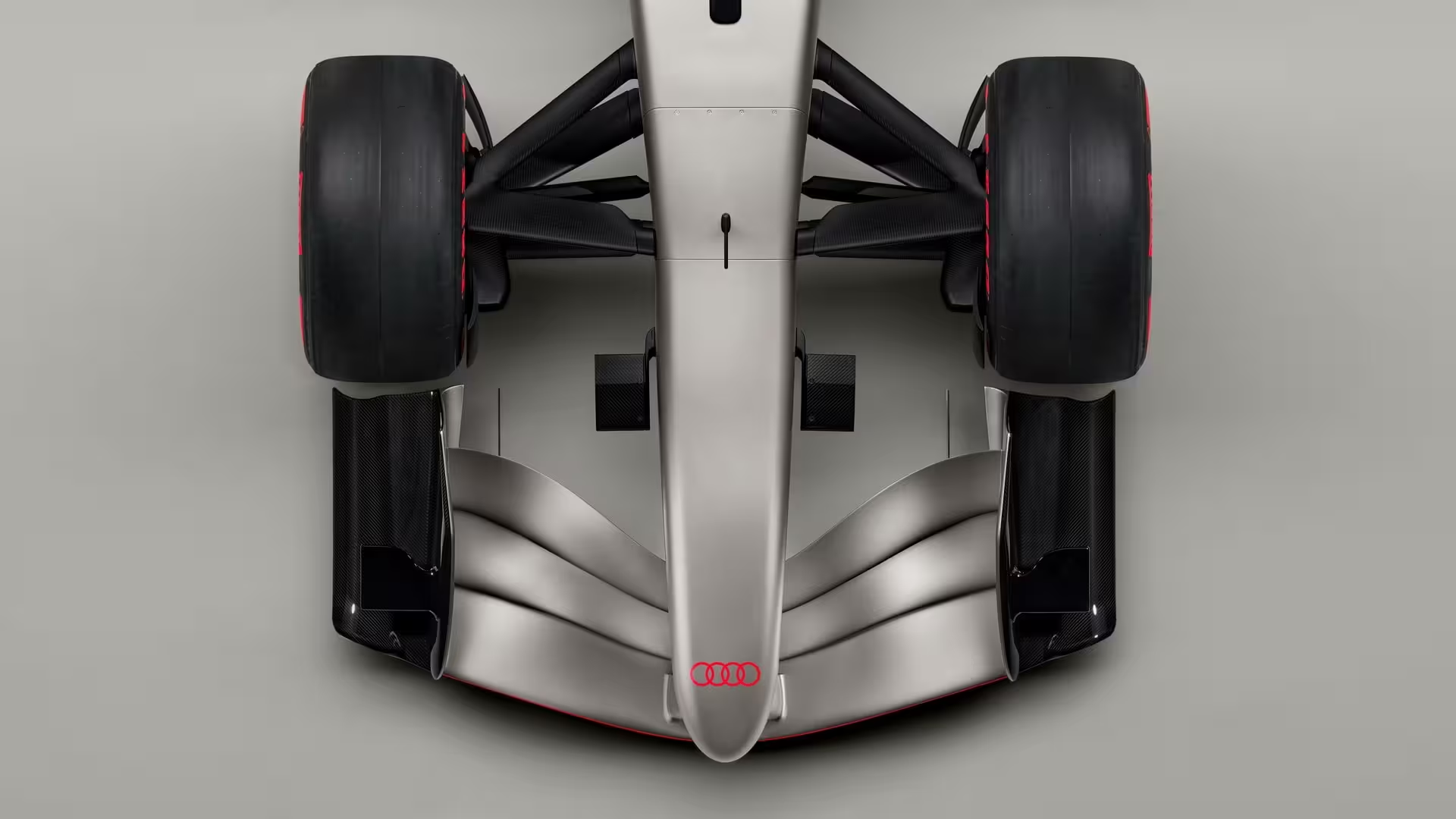
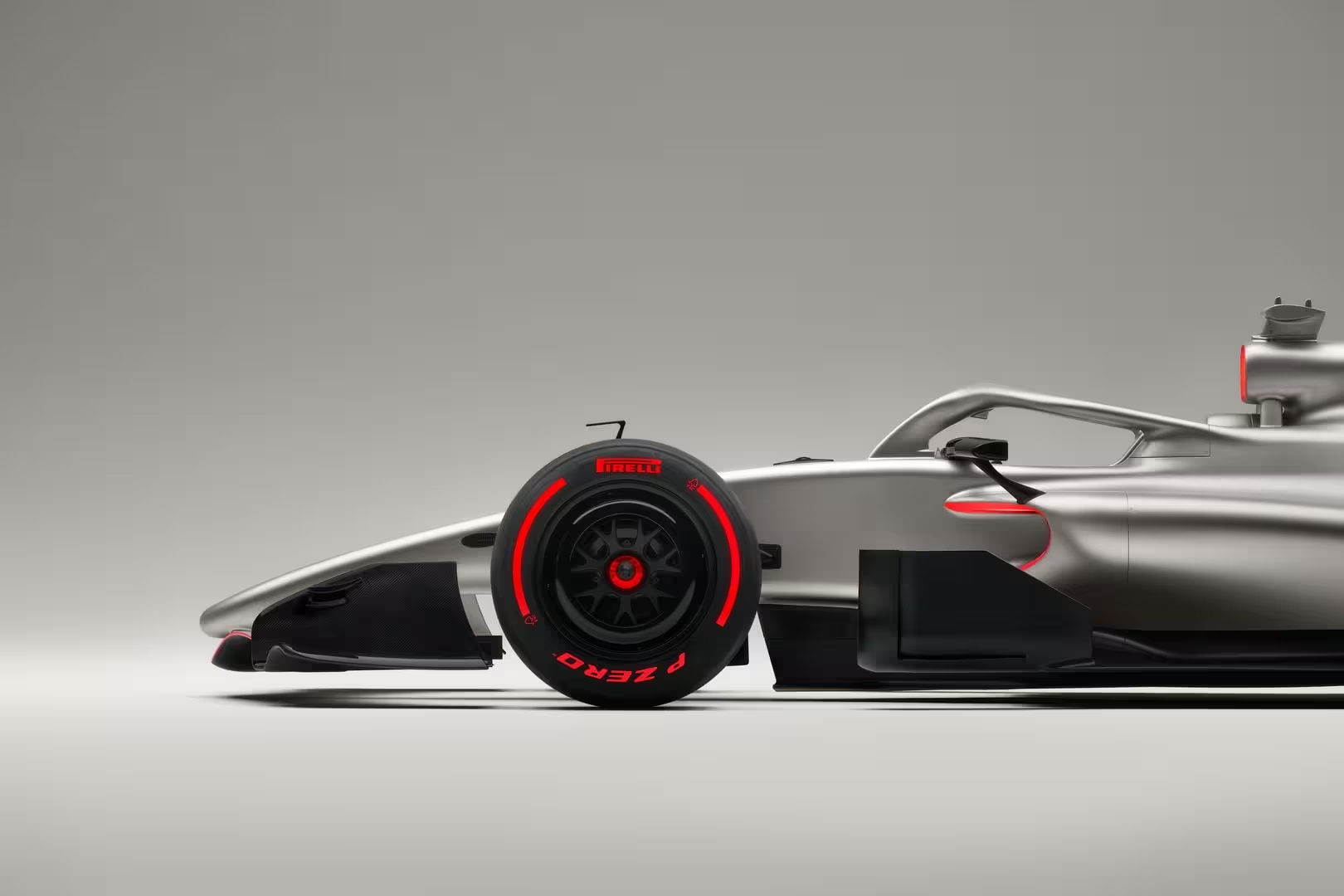
Audi’s debut livery concept for Formula 1 has the paddock talking. The Ingolstadt marque has revealed a copper-and-black scheme with red accents at the rear — a modern, restrained look that echoes the brand’s motorsport heritage. It’s clean, technically polished and undeniably attractive on paper. Yet the choice of a metallic copper raises an immediate concern: under certain light and on TV, could it read as silver? And in Formula 1, silver has a long-established owner.
Why color matters more than you might think
Liveries are not just cosmetics in F1. They are identity, history and instantaneous recognition at triple-digit speeds. Fans and broadcasters associate colors with teams almost instinctively: Ferrari’s red, McLaren’s papaya, Mercedes’ silver — the so-called Silver Arrows — and Aston Martin’s dark green. Those associations carry weight across merchandise, sponsorship value and viewer loyalty.
If Audi’s copper tone skews too metallic, it risks visual overlap with Mercedes’ silver on-track and on-screen. That’s not merely aesthetic nitpicking; it can affect race identification in chaotic, split-second moments, dilute brand distinction, and even create awkward PR comparisons in a sport that trades heavily on heritage.
What the copper approach gets right
There’s much to like about the proposed concept:
- The copper-and-black pairing feels contemporary and premium, echoing Audi’s road and endurance-racing DNA.
- Red rear accents link the car to performance and aggressiveness without overwhelming the design.
- The restrained palette suits a brand aiming for technological credibility over flamboyance.
This is a livery that speaks to a sophisticated audience and aligns with Audi’s engineering-first image. But sophistication and visibility must balance in a sport where brand identity needs to be immediate and unmistakable.
Technical and broadcast considerations
Metallic paints behave differently under track lighting, rain, shadow and TV cameras. Pearlescent or metallic copper can reflect ambient light and shift tones from gold to gray to silver. At 200+ mph, brief flashes of mirrored paint can read as a different color entirely. For broadcast clarity, pigments that produce consistent color across lighting angles are preferable.
Practical considerations teams must weigh:
- Paint finish: matte, satin, metallic or pearlescent all change perception.
- TV color calibration: different networks and cameras reproduce metallic tones variably.
- Night vs daylight racing: a reflective hue can alter appearance dramatically under floodlights.
Why black-and-red remains a compelling alternative
Audi’s motorsport history — from DTM to endurance racing — often leans on black and red combinations. A bold black chassis with vivid red accents would:
- Provide immediate contrast against a largely colorful grid.
- Avoid visual collision with Mercedes’ silver or Ferrari’s red (by differing in balance and tone).
- Link Audi’s F1 entry directly to its racing lineage, strengthening brand storytelling.
Black-plus-red is also practical: high contrast for viewers, clear sponsor placement, and a look that reads well both on TV and in merchandising.
Haas and the palette puzzle
Haas Racing’s recent white-red-black look — influenced by title sponsorship — shows how commercial deals can complicate color territory. While Haas is not a heritage institution like Ferrari or Mercedes, overlapping color families could still create short-term confusion. Audi must factor in not just tradition but the current makeup of the grid when finalizing shades.
Branding, fan connection and long-term goals
Audi’s public goal is ambitious: build a competitive F1 team that contends for championships within the decade. CEO Gernot Dollner has said the company doesn’t enter Formula 1 to participate passively — they want to win and plan to fight for the World Championship by 2030. If you aim to be a title contender, your visual identity should be as decisive as your engineering roadmap.
Colors influence emotional bonds with younger fans. A distinctive livery helps new followers immediately pick a car out of the pack, buy a cap, or follow a driver. Early seasons are formative; first impressions on preseason testing and the opening rounds echo for years.
Is Audi playing it safe on purpose?
There’s an argument that Audi’s copper choice is deliberately cautious. Establishing a new team in F1 is costly and slow; a muted, dignified livery can communicate seriousness and technical focus while avoiding the spectacle of sudden, risky design choices. In strategic terms, a conservative visual rollout can be sensible — especially if the team prefers to iterate the look as performance improves.
But there’s also value in boldness. A confident, recognizable livery can accelerate fan adoption and help Audi carve out a unique visual identity from day one.
What could Audi do next?
If Audi wants to keep copper while avoiding silver confusion, some paths forward include:
- Adjusting finish to a non-metallic satin or matte copper that minimizes reflectivity.
- Emphasizing black panels and red accents to increase visual contrast.
- Testing broadcast samples under multiple lighting setups and camera systems before final rollout.
Quote to consider:
"We are not entering Formula 1 just to be there. We want to win," Audi CEO Gernot Dollner said. "It takes time, perseverance, and tireless questioning of the status quo. By 2030, we want to fight for the World Championship title." If that’s the plan, the livery should be unmistakable.
Final thoughts
Audi’s first official livery concept is an attractive and modern take, but the copper hue walks a fine line. In a sport where the Silver Arrows and Ferrari’s red are practically universal signifiers, Audi must ensure its color reads the same way to fans, broadcasters and sponsors — in every light and at every speed.
Whether Ingolstadt tweaks the finish, pivots to a black-and-red identity, or finds a unique non-reflective copper tone, this decision will shape the team’s perception long before it begins fighting for podiums. For car enthusiasts and F1 followers alike, the livery will be a first glimpse of Audi’s intentions — and hopefully, a visual that becomes as iconic as their engineering ambitions.
Highlights:
- Copper looks great but risks appearing silver under some lighting.
- Black-and-red would offer clear differentiation and a link to Audi’s racing history.
- Practical testing with broadcast cameras and night lighting is essential before finalizing the paint.
Whether you love the copper concept or prefer a bolder black-and-red identity, Audi’s entry into Formula 1 is one of the biggest automotive stories in years — and the livery is the first chapter in a long and promising book.
Source: autoevolution
Comments
mechbyte
Is copper really a smart move? On camera it might read silver, pretty confusing for viewers. Why not go bold black+red instead? hmm
v8rider
Wow, copper looks classy but I'm stressin' about it reading silver on TV... Could be messy in twilight races. Needs tests, pronto!
Leave a Comment