
2 Minutes
Rumors travel fast in the smartphone world. One week a UI leak is anointed as the next big thing; the next, a design director is tweeting it away.
Chinese chatter recently claimed ColorOS 17 would borrow heavily from Apple’s Liquid Glass aesthetic — the glassy translucence that iOS 26 introduced and which Apple itself is quietly dialing back in iOS 27 while offering a user-adjustable slider. The story had the kind of momentum that makes headlines: familiar visual language, softer translucency, and a more iOS-like polish for Oppo users.
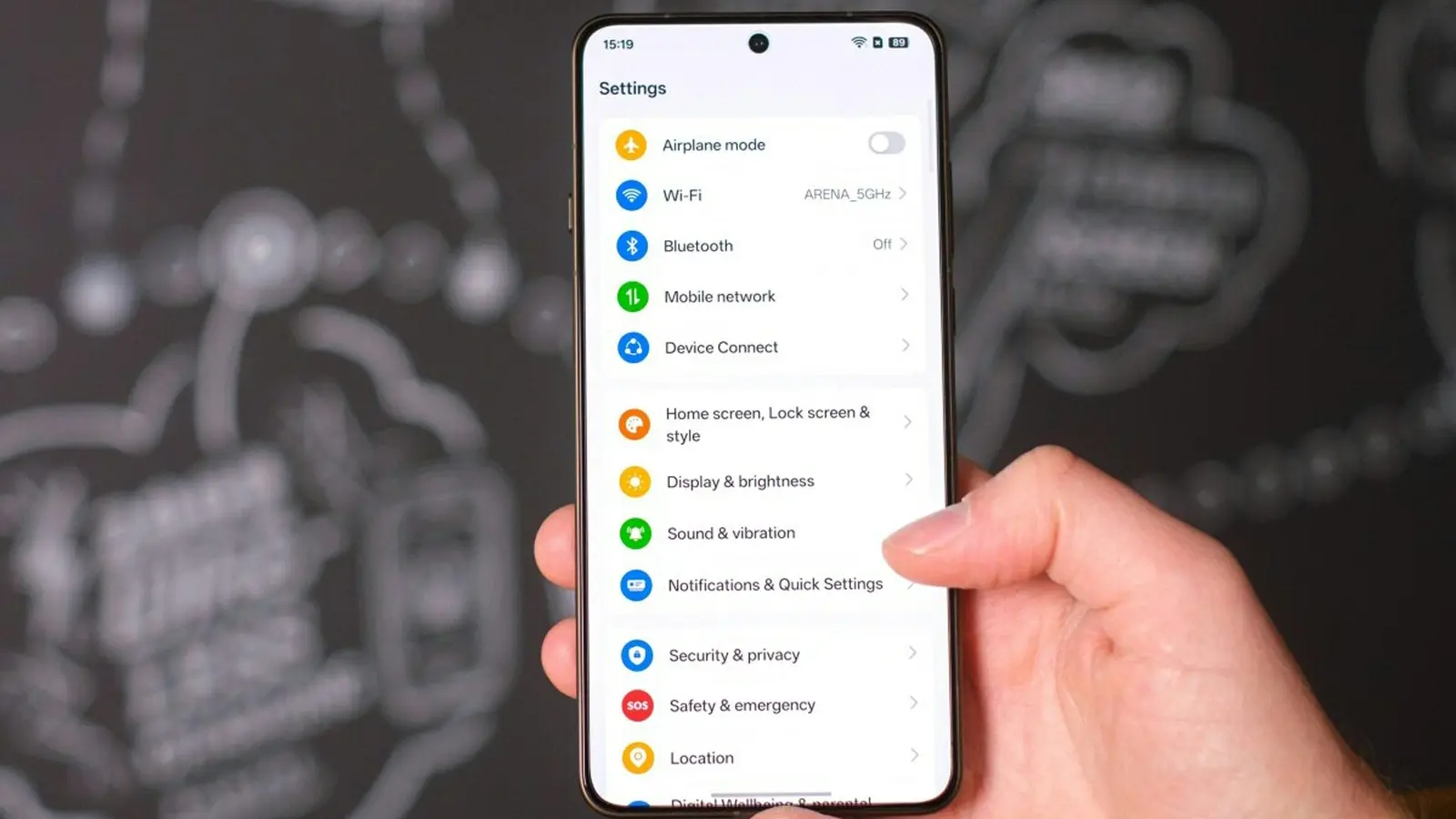
Not so fast. Chen Xi, ColorOS design director, took to Weibo to push back. His message was simple: ColorOS 17 will aim at core usability improvements rather than a sweeping visual overhaul. New features are being postponed, he said, which leaves open whether smaller additions will trickle in via interim updates — think 17.1 or 17.5 — or whether bigger changes wait for ColorOS 18.

In plain terms, Oppo isn’t chasing Apple’s Liquid Glass — at least not this cycle.
That does not mean every Android skin will avoid similar directions. Design trends ripple across the industry; some competitors might well pursue a glassier, more translucent look inspired by iOS. But Oppo appears focused on refining interactions, stability, and the everyday feel of the system: faster animations where they count, clearer layouts, and fewer visual distractions.
For users, that’s a pragmatic choice. A bold visual pivot can delight some and alienate others. Polishing core UX can improve daily satisfaction for millions. Still — aesthetics matter. People notice shadows, blur, and the way icons sit on a home screen. Would you prefer a ColorOS that mimics Apple's gloss, or one that keeps its own character while smoothing rough edges?
Either way, Chen’s clarification puts a stake in the ground: ColorOS 17 is about substance over style. The conversation now shifts to how Oppo will balance subtle visual evolution with meaningful usability gains.


Leave a Comment
Comments
No comments yet. Be the first.