
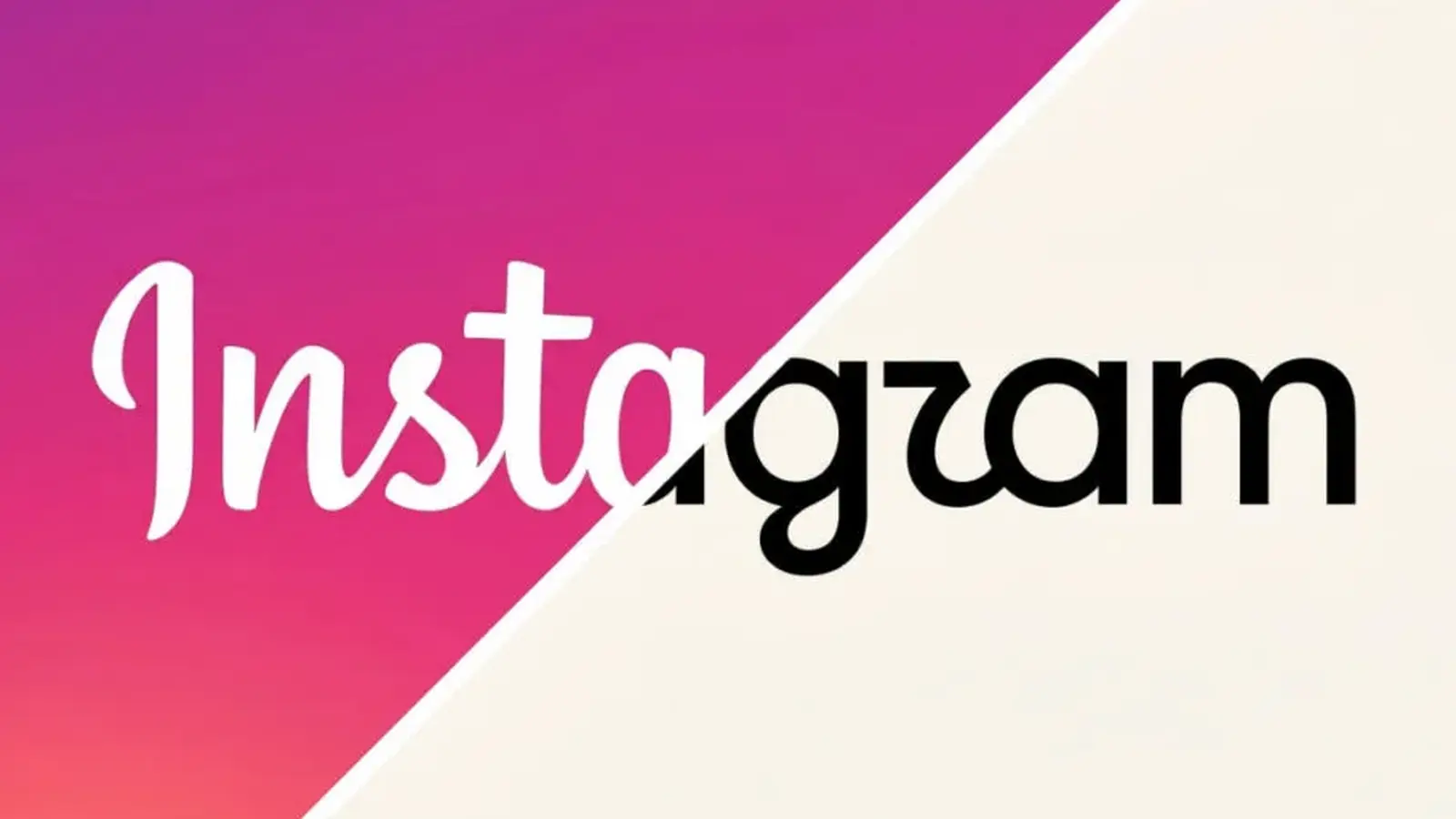
A tiny stroke. A lowercase "r" that some people read as a "z." And suddenly, a global gag was born: Instagzam. The internet does what the internet does best — it notices details and turns them into jokes fast.
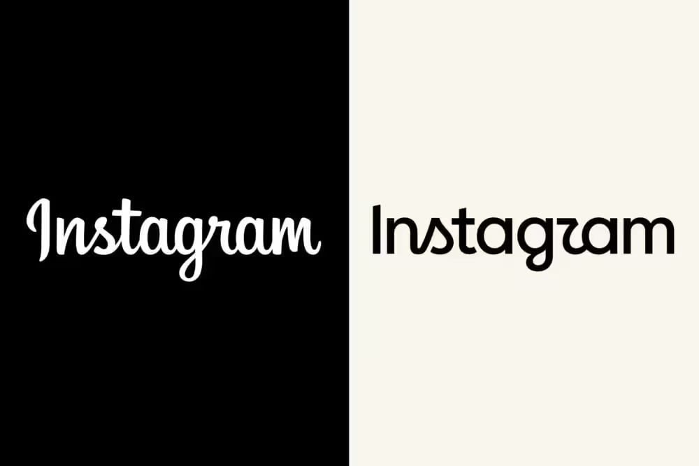
Instagram unveiled a refreshed wordmark last week, the platform's first type update in a decade. The reveal arrived with the predictable cocktail of mockery, memes and fast-moving opinion. Some users zeroed in on the new shape of the letter "r," arguing that it looks more like a "z" and handing meme-makers a tidy new punchline.
Jasmin Prabost, Instagram's design director and one of the leads on the redesign, took those reactions in stride in a conversation with Variety. Her point was simple: the visual identity hadn't been touched in ten years while the product itself had changed dramatically. "Ten years had passed since our last update, and the platform evolved a lot — so it was time for a deeper refresh," she said. "This mark preserves the warmth people love, but moves us forward."
The redesign leans on clearer, bolder forms but deliberately keeps a handcrafted feel. Prabost described the objective as building something familiar to Instagram's community, but more contemporary — a mark that reflects where users are today. Acceptance of the future, she explained, matters as much as honoring what made the product beloved in the first place.
Did the design team expect ridicule? Not exactly. Did they prepare for public feedback? Absolutely. Prabost said the team ran multiple external feedback rounds prior to launch and took those responses seriously. At the same time, she emphasized that decisions balanced research data against the team's creative convictions. Those conversations, she added, clarified and strengthened the final direction.
Prabost also welcomed the cultural noise. "We really enjoyed seeing people's feedback and other brands joining in — from memes to brands tweaking their own marks to mimic the vibe," she told the outlet. Pride in the work came through: the team is happy to put the design into the world, imperfections and all.
Emotional goals guided the change: expressive creativity, calm confidence and the warmth of a carefully made piece. The aim was not to erase Instagram's personality, but to present it with sharper, more deliberate strokes.
Was this move an attempt to align Instagram's type with Meta's broader sans-serif system used across Facebook and other apps? Prabost dismissed that as the whole story. "Wordmarks across the Meta ecosystem aim to reflect each app's independent identity while sitting comfortably within a larger family," she said. The redesign is rooted in Instagram's own community and priorities, even as it remains coherent with Meta's wider brand framework.
Design provokes. And when it provokes, it tells you something — about user expectations, about a brand's place in culture, and about how small typographic choices can ripple far beyond their pixels.


Leave a Comment
Comments
No comments yet. Be the first.