3 Minutes
Samsung just handed designers another blank canvas. At first glance it’s a small thing: the bottom bars in Quick Share have traded harsh rectangles for softer, pill-like shapes. But small gestures often signal bigger intentions.
Images shared by Tarun Vats show a noticeably more compact floating pill-shaped bottom bar in what appears to be One UI 9 (Android 17). The tabs are rounder, tighter, less obtrusive than the pill-and-tab treatment introduced in the current One UI 8.5 beta (Android 16 QPR2) rolling on Galaxy S25 models. Clean. Calm. Intentional.
Why does this matter? Because UI tweaks aren’t just cosmetic. They affect perceived speed, information hierarchy and how comfortable a phone feels during quick, repetitive tasks. A slimmer floating bar can save screen real estate and reduce visual noise while nudging interactions toward the center of the display — a subtle nudge toward one-handed ergonomics.
Not everyone will love the change. Design preferences are personal. Some users prefer the familiar rectangular tabs of One UI 8.0, which stand out more and feel solid under the thumb. Others will welcome the new, refined look. Samsung knows this, too. They’ve changed direction before after internal testing and early feedback. Think of these leaks as early sketches rather than the final print.
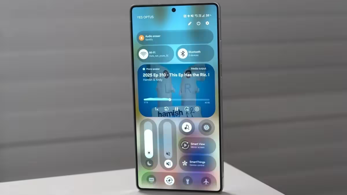
Technically, the shift is simple: rounded corners, reduced padding, and a more compact floating element. Yet those modest edits are part of a larger trend across mobile interfaces — softer shapes, less clutter, and interfaces that blend into content instead of shouting for attention. One UI 9 appears to be leaning into that language.
Timing remains uncertain. One UI 8.5 hasn’t reached stable release across eligible devices, and Samsung typically irons out visual and interaction details late in development. It’s plausible that this pill refinement will arrive as a living part of One UI 9’s visual refresh, possibly debuting with the next flagship cycle, but it could also be adjusted or rolled back based on testing.
This early glimpse tells us what Samsung designers are experimenting with — elegant restraint rather than heavy-handed change. Expect more iterations, and watch how these small visual choices ripple into usability and user reaction as the software moves from early builds to public releases.
Source: sammobile
Leave a Comment